I have looked at my initial idea and now I'm gathering my ideas in a proposal for my student magazine. I have thought of the important areas I need to think about.
Who are you aiming your magazine at specifically? I will be aiming my magazine at students aged between 16-18, both male and female who attend South Downs College.
What will your magazine be about?
My magazine will be about different things going on in the college and will provide lots of information on things like latest news, events, sport, social scene at college, achievements and other features you'd expect to see in a college magazine.
What are your ideas for cover lines?
My ideas for the cover line is that they will be in a clear font yet not to boring, I think it will be a black font as the rest of the magazine will be colourful and bright so I don't want it to look to busy and unable to read.
What title have you decided on and why?
I have chosen the title South Downs Speaks. This is because it's quite catchy and the magazine is about South Downs so using the word 'speaks' suits quite well. Also the use of alliteration makes it stand out.
What font's do you want to use?
I'd like to use quite simple fonts because I feel it looks more effective and it's much clearer than a complicated font which is to fancy and you can't actually read. Something like Arial or Comic Sans would be a good font to use and then for the title I might use something a bit more interesting.
What are your ideas for tag lines?
Personally I don't want to use a tagline because I feel it's not a massively important aspect to a magazine. I find them a bit to cheesy sometimes and I don't want my magazine to feel like that so I probably won't have a tagline.
When in the year will it be published?
I think I would have the magazine published every term so autumn term, winter term, spring term then summer term. This way the magazine can be appropriate to different times of the year for example the summer edition would focus on exam information.
What kind of image do you expect to put on the front cover and how will you go about getting this image?
I think I will use and image of two or three students, boys and girls, and have them look like they are having a good time with the backdrop of a college area such as a cafe or library. To get this image I will ask my friends if I can use them as models for my front cover and use a college camera to take the picture.
How frequently would it be published?
I would have the magazine published every term so that would be four times a year.
What are the dimensions of the cover?
I think my magazine will be a normal A4 size like many magazines you get nowadays.
What images/colour would you use on the contents page?
On the contents page I would use blue and green colours for the font as they are the college colours and have a simple white background. I would have a smaller image faded into the background of students at the college so there is more focus on the actual contents.
Now I have created a proposal I am clearer on my ideas and what I want my magazine to be like. I can now start thinking about starting the process of making my magazine, firstly by creating a flat plan.
Monday, 31 October 2011
Initial Ideas
After starting to understand the way in which magazines are produced with everything in mind, below I have begun thinking of initial ideas to help me in the process of creating my college magazine.
Target Audience
Target Audience
- 16-18 year olds
- Boys and girls
- College Students
- College Information
- Student Life
- Student Discount
- Latest Events
- Student social life
- Sport
- College trips
- Extra curricular activities
- Bright
- College colours (blue/green)
- Have to appeal to both male and female
- Reduced palette
- Eye catching
- Every term
- South Downs Speaks
- South Downs Says
- SDC
- SD Central
Images
- Students
- Boy and a girl
- 2 or 3 people
- Happy people
- Medium shoulder shot
- Stand out colours
- Certain cover line words to stand out
- Eye-catching
- Bold
- Readable Font
I decided to list my ideas as I feel it's a good way to have all your ideas clearly in front of you. Obviously I will have to keep looking back at this for inspiration during my designing process as it is full of ideas. Next I will create flatplans of what I would like my magazine to include before going on to make the proposal.
IPC Case Study
IPC are a media brand that produce over 60 million media brands. In print alone, two thirds of UK women read print part of IPC media. IPC media have something for everyone but the three markets they focus on mostly are men, mass market women and upmarket women.
Examples of men's magazines they publish are Rugby World, Nuts, NME and Horse & Hound.
Examples of mass market women's magazines they publish are Look, Now, Chat and What's on TV.
Examples of upmarket women's magazines they publish are Marie Claire, InStyle, Ideal Home and Women & Home.
Named above are a few of many magazines published with IPC Media.
IPC or The International Publishing Cooperation Ltd was formed in 1963. It was formed of the three leading UK magazine publishers - George Newnes, Fleetway Publications and Odhams Press - merging together and therefore introducing the IPC.
Recent news at IPC is that two of their publications, Marie Claire and InStyle have partnered with L'Oreal Luxury to promote Armani Code with a multi-platform campaign that uses watermarking to unlock additional content. The use of famous brands in their publications is clever as the target market who buy these magazines also buy from these brands.
Thursday, 20 October 2011
To what extent should magazines be held responsible for the social ramifications of the representations they offer?
In magazines aimed at teenage girls such as Bliss, Cosmo Girl, Mizz, Shout and Sugar, which I have analysed in the previous post, there is a lot of talk that they are to blame for social ramifications of teenage girls across the country. I think that some content in these teenage magazines exposes girls to things they are too young to be doing or understand or can make girls very critical of themselves because of what they see in these magazines.
The first thing I think is affected for girls who read these magazines is their body image and self-concept. In every teenage girls magazine is features on celebrities who appear beautiful, skinny and perfect. The truth that the reader doesn't see is that these airbrushed images aren't real. Girls see this perfect image and look at themselves and feel unhappy that their not these ideal people. Really these celebrity images are unrealistic and they don't show images of a celebrity in a bad state because that's not teenage girls are interested in.
I also think girls are introduced to the world of boys and relationships to young because of articles in these magazines. For example girls read articles called 'Kissing Tips' and feel that they should be doing stuff like this when really their a bit young to be doing stuff like this. Also celebrity boys who are popular to teenage girls such as Justin Bieber or JLS are featured and there is a big emphasis on the physical attraction to these boys and they forget about personality. It's quite shallow and will make girls care more about how a boy looks in the future instead of their personality. I personally think this emphasis on boys and boyfriends encourages inappropriate behaviour to young. Also problem pages in these magazines have questions about sex and are asked by girls who are sexually active. This is likely to put pressure on girls who are younger and reading these magazines to do these things because they feel everyone else is doing it when they are probably not. I think sexualisation of girls as young as eleven who are reading these magazines needs to stop.
Celebrities are another huge factor which to quite a big extent should be held responsible for social ramifications. Teenage girls are usually fans of celebrities and the majority aspire to have the lifestyle of these celebrities, although some of what you read in these magazines about celebrities could encourage bad behaviour, such as binge drinking and taking drugs. Because girls want to be like these celebrities they are easily influenced and feel that if they follow the same lifestyle as them they will become like a celebrity. What they don’t realise is the problems celebrities face as a consequence of some of their behaviour as its not printed in teenage magazines. I feel that these problems are not highlighted enough in these magazines.
The last factor which I think is an important issue is the food issues girls develop through the pressure of having a ‘perfect body’ because of certain articles printed. For example if there are tips on having the perfect body and this is portrayed through an image, these girls my feel they have to look like this which would then lead to devastating issues which are sometimes very dangerous such as anorexia, bulimia, body shape issues and size issues. Also if girls are constantly reminded of what is the norm, they may feel scared to admit to things such as their sexuality or careers choice because it’s different to what is talked about in these magazines aimed at teenage girls.
In conclusion I feel that the factors mentioned about are very big reasons as to why teenage girls are growing up to first, not happy with themselves, or having body issues. I think magazines are largely responsible for the social ramifications of teenage girls who these magazines are aimed at.
Conventions of magazines aimes at teenage girls.


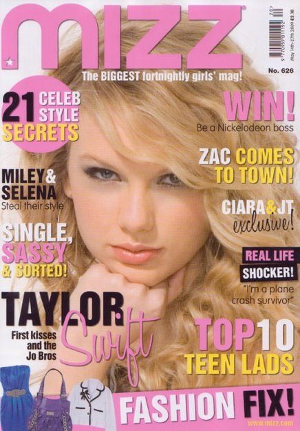


Above are five magazine covers that are all aimed at teenage girls. From looking at these covers and considering they are all aimed at the same target audience, you notice certain conventions that are familiar in all.
The first thing you notice that is a recurring convention is the main picture in the middle of the page that your eyes are first drawn to. They are all celebrities such as Katy Perry and Taylor Swift. These celebrities have been particularly chosen to feature in the magazine because they are popular with teenage girls. This makes it more likely the target audience will buy the magazine. Although the majority of celebrities on the front cover have adult lives which might change teenage girls attitude towards them, on these front covers they all appear innocent and like the girls they are appealing to through the clothes their wearing to the facial expressions they have.
The next convention that would appeal to the target audience is the colour used for any text whether it’s the magazine title or bodytext. The main colours used are different shades of pink, purple and blue on the majority of the covers and other colours in smaller dosages such as orange and peach which are still used with the other colours. These colours have been used because they are stereotypically ‘girly’ which usually is true. So, by using these colours you are more likely to attract a teenage girl audience because you’re using colours they like.
Also on each magazine cover the titles of articles are all in big font, and use puns all to draw the target audience in. Also the names of the articles all have similar themes. For example, ‘382 ways to be irresistible!’ ’21 Celeb Style Secrets’ and ’63 things you need to know about your boobs’. These subjects are what teenage girls are typically interested in; attracting boys, dressing in the latest fashions and having the ‘perfect body’. So by having these articles within the magazine and making sure the target audience read the title on the front cover they are more likely to get teenage girl buyers.
In conclusion I think the five magazine covers I’ve looked at and probably more all have similar conventions when it comes to ways the magazine companies attract their target market, which here is teenage girls.
Sunday, 9 October 2011
500 Word Analysis on Nylon Magazine Cover

Above is an image of the front cover of a recent copy of Nylon Magazine. It's a fashion magazine with focuses also to music, TV, film, and celebrities. The target market for this magazine would be girls aged between 14 and 25 interested in fashion and the other features in the magazine.
The cover design has helped appeal to this audience in many ways. The first thing that I find would attract the intended audience is the use of a picture of Christina Ricci on the centre of the page, which is the first thing your eyes are drawn to. She is an actress who would've appeared in films and TV shows that the target audience would've watched so they would buy it because their interested in her life. Also the text colour is very appealing to girls. The pastel pink and blue shades complement each other and create a girly look to the cover appealing further to the target market as colours like that are usually associated with girls. Another way the designers have tried to attract customers is by making the titles of articles stand out in black lettering so they draw in the eye of the reader and in that title the words have to attract the buyer. Also words are bigger when they are more important for example the numbers '182' are enlarged because the number is big and the magazine is offering a large number of fashion looks so a girl would be attracted to this as they like being given style advice. The white background makes it easier for the light coloured words to be read giving a clearer picture and making it easier for someone to take in the magazine without having to read too far into it to get the idea. When a girl buys a magazine she wants to find it fast so to make sure that Nylon magazine stands out they have to make it easy to read.
Other terminology used that you would find in most magazines is a tagline, cover line, informal text style and a barcode which aren’t necessarily used in magazine design to attract the target audience as much as others. They are more used because that’s part of the front cover of a magazine.
The text style is in serif so it looks simple and contemporary, as style which you would use on a magazine aimed at 14-25 as it sets the tone as not being too serious.
Overall I think that Nylon magazine have designed the front cover well in order to appeal to and gain to the target market of girls aged between 14 and 25. It has been achieved through pictures, celebrity features, text, titles and colour and all have been carefully selected to gain buyers from the target market.
Subscribe to:
Posts (Atom)