Monday, 12 December 2011

Music Magazine Research

In the magazine world the amount of music magazines available is growing. This means that there is something out there to suit all music tastes, ages and genders. Below are a few of many different music magazines available.
Rolling Stone Magazine                                                                                                       


Rolling Stones magazine was founded November 9, 1967 and is part of the Wenner Media group. Published bi-weeky it is an American music magazine but also covers liberal politics and popular culture. The type of music it covers isn't specific to one genre and includes pop, alternative, rock and soul with most other areas of music covered.
In the 1990's the magazine was criticised as it changed it's content to attract younger readers often focusing on young television or film actors and pop music. This led to criticism that the magazine was emphasising style over substance. In recent years, the magazine has resumed its traditional mix of content, including in-depth political stories, and has seen its circulation increase.
This magazine is a good one to look at as it is very popular and sells well world wide and has become famous for creating posters out of popular covers and has lots of information available for you to research the magazine. 
The stars that appear on the front cover such as Adele attract both genders and the age range of people buying this magazine ranges from 18-30.
NME Magazine


NME magazine was first released 7 March 1952. It is a UK based, weekly music magazine and is part of IPC media edited by Krissi Murison. NME stands for New Musical Express and originally started as a music newspaper later turning into a magazine format nearer the 1980's. It was the first British paper to include a singles chart and in the 1970s it became the best-selling British music newspaper. 
NME is a very popular music magazine and sells well across the UK and from it's success NME has other projects including the NME awards and NME tours. The target audience of the magazine is teenagers, both boys and girls, aged between 15 and 25. The music genres it tends to cover are rock, alternative and indie.
MOJO Magazine


MOJO magazine is a monthly music magazine first published November 1993. It's a British magazine based in London and is part of Bauer media group. 
MOJO is a popular music magazine published initially by Emap, and since January 2008 by Bauer, monthly in the United Kingdom. Following the success of the magazine Q, publishers Emap were looking for a title which would cater for the burgeoning interest in classic rock music. 
The magazine is noted for it's in-depth cover of both popular and cult music acts, covering classic rock bands like The Beatles as well as newer and left-field acts. 
Because of it's varieties of music genres and time periods the age group of the magazine I would say is men from the ages of 18-40. 
It is a very popular magazine and is becoming more well known.
Q Magazine


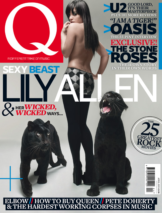
Q magazine is a popular music magazine published in the UK. The first issue was released October 1986 and is part of the Bauer media group and is edited by Paul Rees.
Founders Mark Ellen and David Hepworth were dismayed by the music press of the time, which they felt was ignoring a generation of older music buyers who were buying CDs — then still a new technology. Q was first published in October 1986, setting itself apart from much of the other music press with monthly production and higher standards of photography and printing.
It focuses on more mature music as it's aimed at the older generation and the front cover above which has a semi-naked picture of Lily Allen suggests its aimed at men aged 30+.


Below are other music magazines which are around today, some popular and some not well known.
top l-r: Billboard magazine, Kerrang magazine
bottom l-r: Top of the Pops magazine, WIRE magazine.


Tuesday, 22 November 2011

Final front cover for my student magazine

Below is the final design of my student magazine. Overall I am quite happy with the way it turned out. The colours not only represent the colours of South Downs, relating to the fact it's a college themed magazine, but I also feel that looking at the cover, I feel that this colour pallette will be attractive to boys and girls as they are neautral colours. The type used for the taglines is quite bold and the way that the article names are in larger bolder letters attract the audience to see what they say. The contrasting blue and green pattern in coverline names I feel is also a fun twist, that just makes the overall cover look more appealing. The elipsis tool I used to create the puff I personally think suits the coverline of WIN! because it stands out and jumps out at you, something you would do if you won a competition. I'm really happy with the way the image of my student is alligned right with a white background that leaves room for all the coverlines. I also am happy with the masthead and feel the design chosen by my classmates was the right one. Overall  I am happy with this cover and feel that it could be attractive to the 16-18 year olds attending South Downs and they would want to read it after taking a first glance at the cover.

Monday, 21 November 2011

Coverlines

1. 'Exam Pressure?' We tell you the best tips for keeping calm and earning a good grade. The rhetorical question used as the coverline makes the readers think about their exam worries so read on and then see inside there is tips on how to beat the pressure meaning they will pick up the magazine.

2. 'J'adore Paris' Paris trip photography. The use of a French phrase which people are familiar with makes the reader wonder why this has been used so then they can see that it relates to a Paris photography trip inside, meaning interesting pictures that students will want to look at.

3. 'Students of the Future...' We hear about your dreams for the future. Students from South Downs want a good future and the coverline here is like a calling to them, drawing them in to read how other peoples dreams came true.

4. 'Plus!' All the dates you need to know for Spring 2012. Plus! is a typical technique used that makes the readers look in interest in what the coverline could be talking about. It persuades the reader to go on my saying need to know, as they feel that there must be something important inside.

Flatplan

I created this flatplan on Microsoft Word then printed it out, took a picture and saved it as a JPG so I could upload it onto blogger

Beginning putting the cover together

Now that I have chosen my front cover image and masthead for my college magazine, South Downs Speaks, I can begin putting the two together and picturing what the two look like together. Once I've done this I can begin adding in the other details on my front cover such a puffs, coverlines and the fonts and colours I will use for them.


This is my final masthead
This is my final image


And together this is what they look like together


Masthead Ideas

I decided that I wanted the title of my college magazine to be 'South Downs Speaks'. Now that this was decided I had to think of a masthead design. I wanted it to stand out on the page, so that means a clear easy to read font and clear colours. Thinking of colours, I wanted them to be bright but also suit South Downs personality, so I firstly decided the colours I wanted were blue and green which are the college colours. I started creating different variations of the title using these colours and experimenting with different fonts on the programme InDesign. Below I narrowed it down to four designs I liked the most.
To make my final design I went around my class taking a tally on which masthead they liked the most. Here are the results:


Masthead 1: 6 people voted
Masthead 2: 1 person voted
Masthead 3: 2 people voted
Masthead 4: 1 person voted


From the results Masthead 1 was the most popular so I will use that one, I also think it is a good design, the font is clear and the colour is bright and easily catches the eye.

Photography for front cover and final picture

For my front cover I needed a picture which would be the main feature on the front of my magazine. I took lots of pictures so I had a big choice and could pick the perfect picture. It had to be from the waist up and have enough blank space around it so there was room for text including the title. Eventually I decided on the image below. I feel it is the best picture I had for many reasons. Firstly my model is place slightly to the right of the frame. This means that there is lots of surrounding space for everything else on the cover. Also his pose and facial expressions are happy and welcoming which is suitable for an image to be used on the front of a college magazine. The background is also blank which leaves a clear space for everything else. Altogether I am happy with the final image I'm using for my front cover.